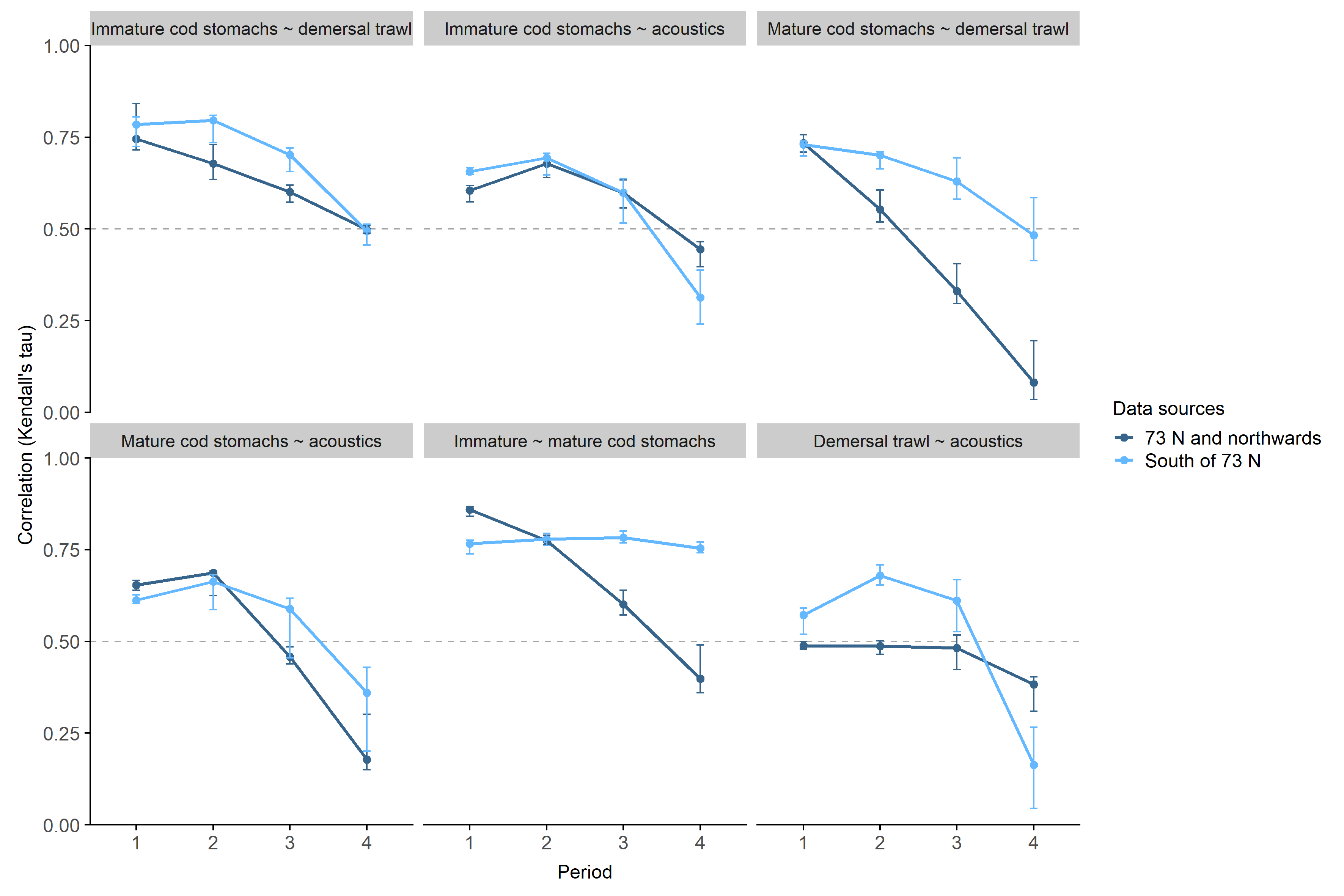
Figure
3.9: Mean of annual spatiotemporal correlations between predicted
capelin densities from different sampling methods through periods
1-4, divided by area (light blue = south, dark blue = north). Error
bars show the variation between years (minimum-maximum correlation).
Note that the correlations in period 1 are based on fewer years
(Table 2.2). The purpose of the dashed line at y = 0.5 is to aid
comparison between different panels.